GoodRx | Senior Product Designer
Point-of-Sale Rewards Redemption
Bringing rewards redemption to the web while making prescription savings the easy choice.
The challenge
The same page needed to answer a different question for every member.
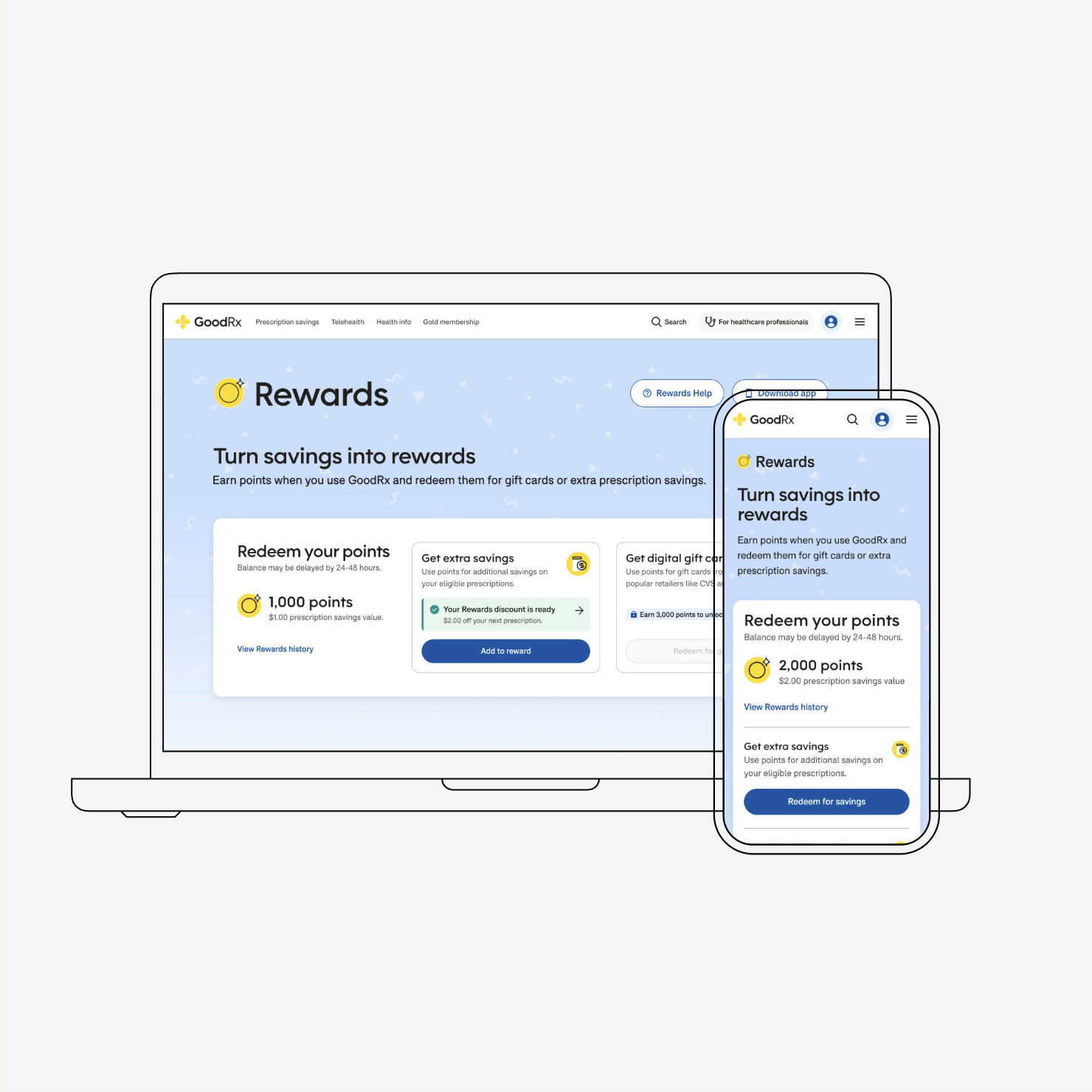
Rewards redemption already existed in the GoodRx app, but bringing it to the web meant designing for members at very different stages of earning and redemption.
At the same time, we wanted to encourage members to use their points toward prescription savings rather than gift cards, without taking that choice away.
My approach
Before designing the experience, define what each member needs from it.
One experience needed to make sense across all member states.
Rewards could look very different depending on a member’s claim status, activation progress, point balance, existing savings, and membership level.
I worked through seven use cases to define what information, actions, and redemption options should appear in each state. This gave the experience a consistent structure while allowing it to respond to where each member was in their rewards journey.
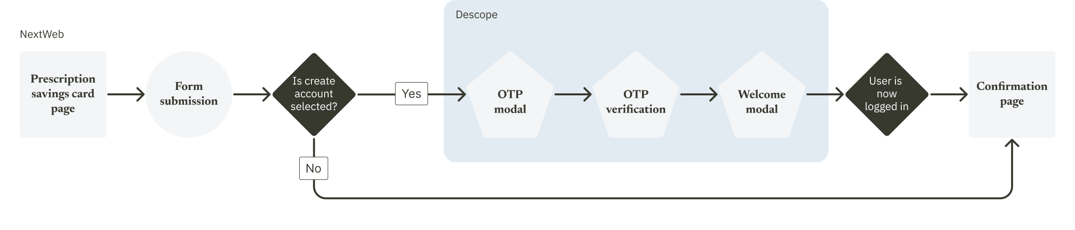
Extending an existing pattern.
Because rewards redemption already existed in the GoodRx app, I used its behavior as the foundation rather than reinventing how rewards worked.
I translated those patterns to responsive web while designing the additional states and hierarchy the experience required.
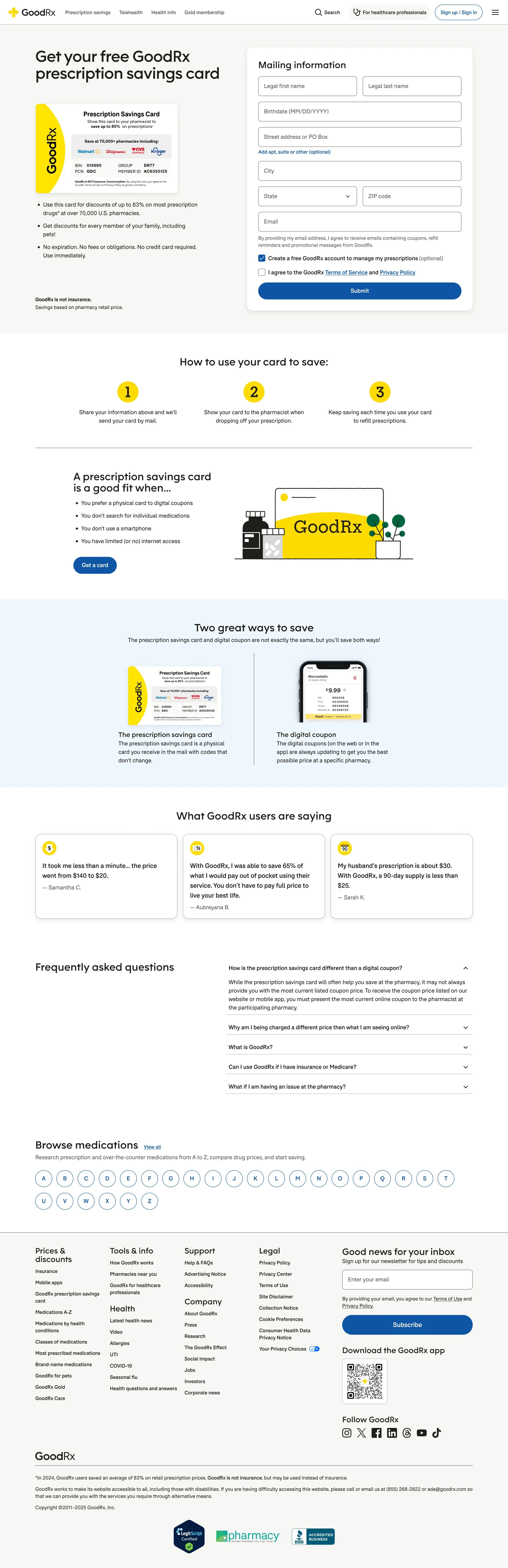

Prioritizing prescription savings.
The two ways to spend points weren't equally important.
Members could use eligible Rewards toward prescription savings or redeem them for gift cards, but the product strategy prioritized helping members save on prescriptions.
I separated prescription savings from the existing gift-card flow and gave it greater visual prominence, making the preferred path easier to understand and access without hiding the alternative.
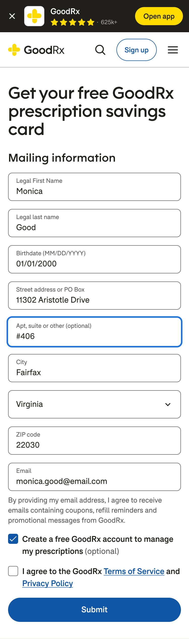
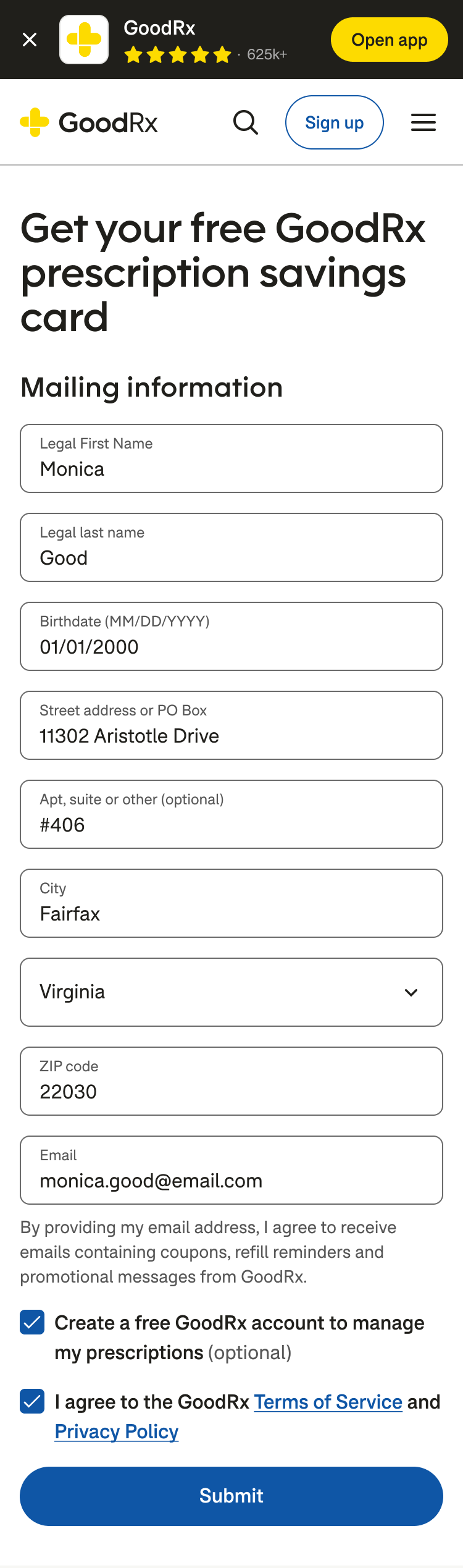
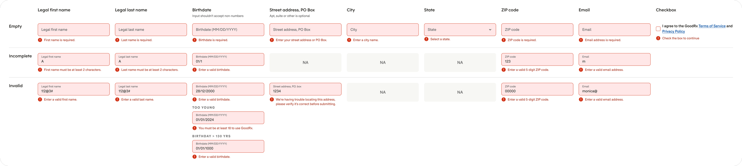
Google Maps autocomplete helps users by suggesting and filling in address details as they type, so they don’t have to enter everything manually.
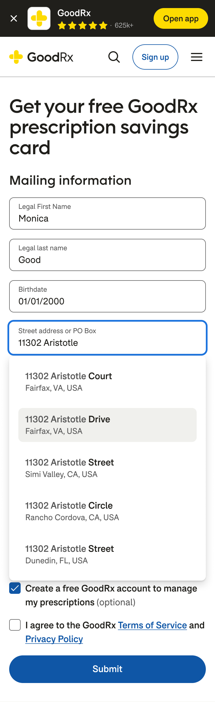
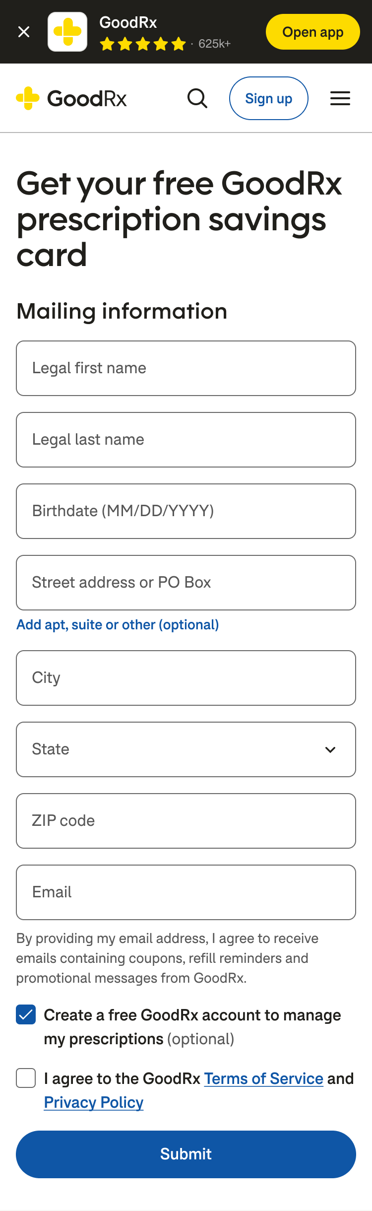
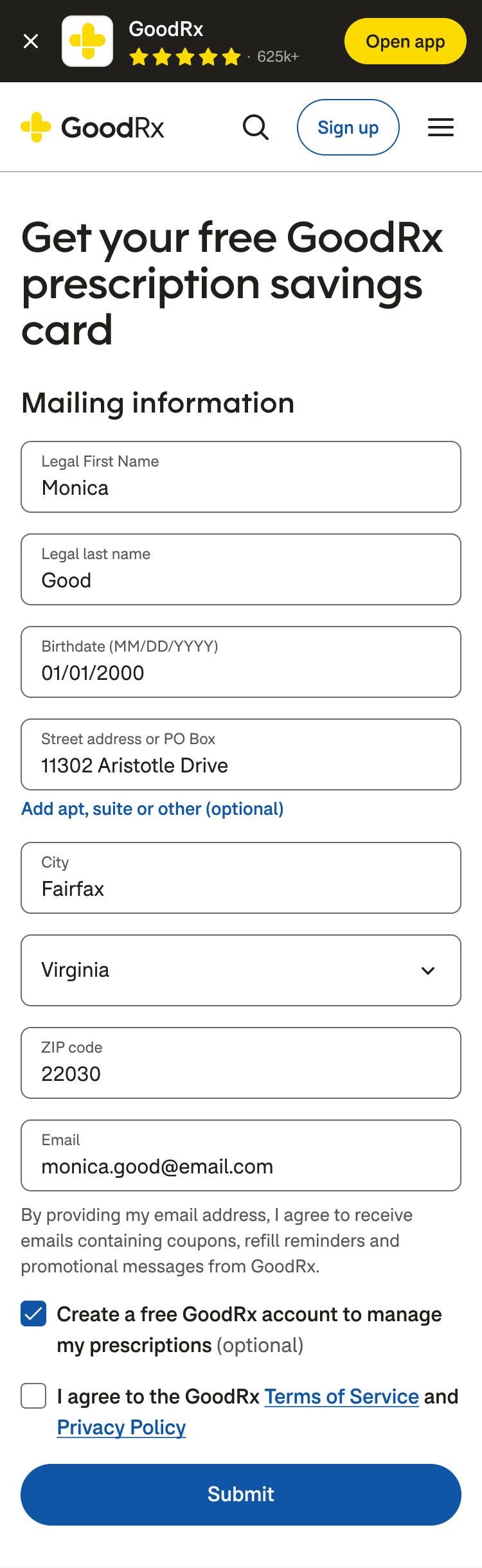
Progressive disclosure hides the optional apartment, suite, or other field until a user needs it, keeping the form simpler.
Sometimes the right action wasn't redemption at all.
For members who hadn't completed a claim, hadn't earned points, or still needed to finish activation, I designed the experience around what they could do next rather than presenting an empty or unavailable redemption experience.
The same system was adapted for active discounts, additional points, gift-card eligibility, and Gold membership while maintaining a consistent underlying structure.

Making rewards cumulative.
Redemption wasn't always the end of the journey. Members with an active prescription discount could continue earning points and add more rewards to their savings.
I designed this state to recognize the value they'd already earned while making the next redemption clear, allowing rewards to behave like an accumulating benefit rather than a series of disconnected transactions.
Outcome
Good incentives don't have to remove choices. They can make the better choice easier to select.
The project brought rewards redemption to the web through a flexible framework that accommodated eligibility, activation, prescription savings, gift cards, and membership states.
By separating prescription savings from gift-card redemption and giving it greater visual prominence, I could support the business goal of encouraging savings while preserving members' ability to choose how they used their rewards.